Welcome to Squaremuse! We are so excited to share this journey with you.
On this page you will find documentation and video tutorials to set up Black Ónyx demo (use code demo if accessing the link directly). In this initial article, you will find the following videos to get you started:
Quick Intro & Getting Started on Squarespace
Squarespace 7.0 and dashboard overview
Welcome message
Requirements for Implementing Black Ónyx:
Business Plan - recommended, since the personal plan has a limit of 20 pages.
Squarespace 7.0 Mercer Template
GETTING STARTED ON SQUARESPACE
SQUARESPACE 7.0 AND DASHBOARD OVERVIEW
PASSCODE FOR ALL BLACK ÓNYX VIDEOS: blackonyx
*Please note that the folder structure in our video tutorials may be slightly different from you have due to updates. However, this does not effect the setup process and steps shown in our videos
Due to recent Squarespace interface changes in the dashboard your view of page building will look slightly different. However, this does not affect the process of your design kit implementation. All you need to know is that Index and Gallery page types remained the same in the new dashboard, and the only difference is the way a Content page is named. You need to select a Blank to be able to add a section under your Index, as illustrated in the screenshot:

Whereas in its previous version Squarespace used to open the Page’s editing options right away once you’ve created it, win the new Squarespace dashboard when you add a Blank you need to hover over the section and click on edit to be able to update it with content:

Style Kit Presettings
Once you have downloaded BlackOnyx files and unzipped them, you will notice that the files are all organized by folders, to make it easier to find and use the different elements we’ve created for you. All of the files included will help you setup the BlackOnyx demo on your Squarespace, as well as customize elements to personalize it, which is covered in the article Adding Personal Content.
For this step you need to find the Style Kit folder and open the Style Kit.png file, which is a style guideline. The first step to setup BlackOnyx is to stylize the fonts and combination of them that you will use across the site pages: H1, H2, H3, Quote, and Normal (or also known as body text), as well as header and footer styling, buttons styles. For this we will have to create first an unlinked page in your Squarespace in order set these styles. The benefit of starting with this step is that all the styles will automatically be applied whenever we create BlackOnyx pages, so we won’t have to repeat the style setup for each page separately. Which is great, as it means less work for you!
Follow the link below to create the Style Kit page. PASSCODE: blackonyx.
Setting up the Styling Page
Styling Process
Header & Footer
If you need to create dropdowns in your header menu follow the instructions described in this article: https://support.squarespace.com/hc/en-us/articles/205813818
Setting Up One Page at a Time.
In the previous step you have setup the style kit, which will now carry across the whole site. And at this point we are ready to create the site pages.
BlackOnyx's sitemap includes the following pages: Homepage - Portfolio - About - Blog- Contact. You can title these as you prefer, or add any additional pages, although in the tutorials below we will cover only demo content.
To add the pages, let's first create our sitemap. PASSCODE: blackonyx.
We have broken down the video tutorials by page so you can take breaks and create one page at a time.
Homepage. PASSCODE: blackonyx.
Homepage
Please note, that there have been updates made to way the first two sections of the Homepage are implemented, which you can view in Site Updates article.
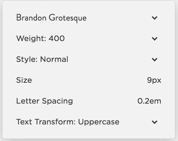
Settings for Poster Font title:


About Page
Blog
Portfolio
Contact
Creating the Shop page is overall quite easy. As you know there are 2 different layouts. One Layout is a standard Grid and the other Layout requires some custom CSS.
Please watch the video below on how to apply the required CSS codes.
PASSCODE: blackonyx
General CSS
Applies to both layouts.
.sqs-product-quick-view-button-wrapper .sqs-product-quick-view-button {
border: 1px solid #fff;
color: #fff;
padding: 12px 30px;
margin-top: 7rem;
}
.ProductList-grid .ProductList-item:hover .sqs-product-quick-view-button-wrapper {
background: url(https://static1.squarespace.com/static/57a89d342e69cffb1a3ad399/t/57ee641f9f74563967bad417/1475240991584/product-icon.png) center 30% no-repeat rgba(0,0,0,.6);
background-size: 30px;
z-index: 999;
}
.sqs-product-quick-view-button-wrapper .sqs-product-quick-view-button:hover {
border: 1px solid #fff;
background: #fff;
color:#000;
}
span.Share-buttons-item-label {
background-color: #fff!important;
}
.collection-type-products .Main.Main--products-item .ProductItem-additional .row.sqs-row .html-block.sqs-block-html {
width: 100%!important;
}
Custom Shop Page CSS
<style>
@media only screen and (min-width:1024px) {
.ProductList-grid .ProductList-item:first-child {
width: 66.66666667% !important;
}
.ProductList-grid .ProductList-item {
padding: 0 15px;
box-sizing: border-box;
}
.ProductList-grid .ProductList-item {
width: 33.333333334%!important;
padding-left: 0;
}
.ProductList-item {
margin: 0 0 34px 0;
}
.ProductList-grid .ProductList-item:first-child .ProductList-outerImageWrapper, .ProductList-grid .ProductList-item:first-child .ProductList-innerImageWrapper {
overflow: initial!important;
}
.ProductList-grid .ProductList-item:first-child .ProductList-outerImageWrapper img {
top: 0px!important;
position: relative!important;
max-width: 100%;
height: auto!important;
left: 0!important;
}
.ProductList-grid .ProductList-item:first-child .ProductList-innerImageWrapper {
position: relative;
}
.ProductList-grid .ProductList-item:first-child .ProductList-outerImageWrapper {
padding-bottom: 0 !important;
width: 100%;
height: 100%;
display: block;
}
}
</style>
Styling Options


Quick View Button Font


Product Title Font

Product Price Font
Polishing Mobile Screens
In this article we will go over the mobile settings for your design.
To view the mobile version of the site you need to hover over the top of your simulated site preview inside your Squarespace account and select from the available icons to view your site in simulated mobile view.

Main options that you will need to set on mobile is your header menu bar and logo position, and open menu options with font styling. These are set from your Style Editor inside your account. For Black Ónyx design the styling options are as following:


Latest Update 21 December 2018
This article covers updates that have been made to the design kit to improve its functionality and make it more user friendly.
For Black Ónyx design kit, the update pertains specifically to graphic elements. If you have implemented the design kit before the update release, you can choose to continue using graphics or follow the instructions below to implement these through CSS code and settings inside Site Styles tab in your account.
The Update affects the Homepage top banner graphics. Now you can edit those directly on the page instead of working with Photoshop files. With the help of the CSS code provided below, all the fonts will also be adjusted.

Copy and Paste the code below into the Design tab -> Advanced -> Custom CSS inside your Squarespace account.
@media only screen and (max-width: 640px) {
.BlogItem-title {
    margin-bottom: 0;
    font-size: 25px;
}
.Blog-meta.BlogList-item-meta {
    margin-bottom: 0!important;
}
.BlogList-item {
    margin-top: 40px;
}
.BlogList-item+.BlogList-item:before {
    margin-bottom: 40px!important;
}
}
/*Home slider Text*/
.homepage section:first-child h2 a {
  word-wrap: initial!important;
}
.homepage section:first-child h2 {
    font-family: Lora;
    font-weight: 400;
    letter-spacing: 0.40em;
    font-size: 1rem;
    margin-right: -8px;
position: relative;
  text-transform: uppercase;
  word-wrap: initial!important;
}
.homepage section:first-child h2 a {
position: relative;
}
.homepage section:first-child h2 a:after {
    position: absolute;
    content: '';
    width: calc(100% - 5px);
    height: 1px;
    background: #fff;
    bottom: 0;
    left: 0px;
}
pre, pre code {
    font-family: futura-pt;
    font-weight: 500;
    font-style: normal;
    font-size: 0.5rem;
    letter-spacing: 0.8em;
    white-space: initial;
    line-height: 1.6;
  text-transform: uppercase
}
Update 19th February 2018
The second section of the homepage can now be built easier within Squarespace account rather by editing files in Photoshop.

Below you can find a video with detailed information on how to build the above-mentioned section.
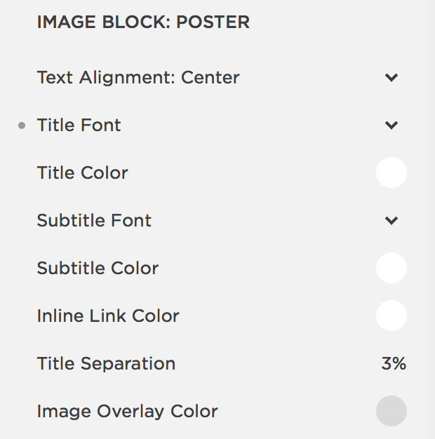
Font settings for title on Poster Image:

Working with Images and Copy
Now that you have setup the kit’s demo pages, you can start updating the site with your own content. Black Onyx design kit has several customizable elements, where you need to add your images. In the folders you've received they are named as 'Covers', while in Squarespace you would need to update them in areas dedicated for 'Banners' or "Thumbnail media'. You will need Photoshop to add your own images to the covers. We have prepared a video where we cover the principles of working with these files in Photoshop and saving your own covers.
But before that, there are several things to remember when Working with Images for digital use:
1. Resize your Images
Make sure to resize all of your images before uploading them to the site. For horizontal images we recommend width at least 1920pixels (if the image should be used for full width then resize to at least 2400pixels wide), and for vertical ones: width at least 1280pixels. This sizing is big enough to keep the images crisp, while also not slowing down your site’s load time.
2. Save for Web
When you finalize resizing your images, choose the option Export -> Save for Web, instead of Save As. This will remove all proprietary data from the file and will result in smaller file size.
3. Save as JPEG
Save all your images as JPEG, as this ensures that the browsers will render them in good quality. Unless a visual element needs to be on a transparent background, then you should save it as PNG.
4. Optimize your Images
We use JPEGmini to optimize the images. You can download their trial and optimize up to 200 images before being asked to buy one of their plans. There are also other tools that you can use, i.e. https://tinypng.com
Note: Please note that some of the graphics, specifically images on section 1 and section 2 from Homepage, that are described in the video below are not relevant any longer since these can be edited through Site Styles tab and CSS code (check article Updates).
PASSCODE: blackonyx
Preparing Written Content
Good job at uploading your own images to the site! You are one step away before you have all your content ready. Now it's time to work on your copy. We recommend the following process for preparing your written content:
1. Copy/paste the demo's text into a separate text document (i.e. you can use Evernote, WordDocument, Mac's Text document, etc.).
2. Estimate the number of characters for each section. There's a lot of online resources that count characters, while you can also view the character and word count in most text documents. Identify those sections that would allow lengthier text, such as About page. Other than that try to stick to character count
3. Establish your content strategy, replying to the following 4 main questions: Who is your Target Audience? How much written content you plan to have on the site and how often you plan to update it? (be realistic here about your time resources) If you were to break down your content to one message, which one would that be? What is your final Call to Action?
4. Start writing your own content instead based around your Content Strategy.
5. If it's a new site, have at least 3 blogposts ready for launch. The first one can be an announcement about your new site's launch, while the next one can dive a bit more about yourself and then about your work. Don't overcomplicate it, and remember that sometimes Less is More.
6. When you're done, have a friend, relative, or industry peer, proofread your Content for mistakes, but also don't hesitate to ask them for feedback and impressions on the actual message of the content. Make adjustments if necessary!
Congrats on adding your content and images to the site. Check out our next article with a comprehensive checklist to prepare your site for launch.
Get Personal with Your Black Onyx Design kit
We have created illustrations and icons that you can use with your Ónyx design kit in order to personalize your site even more. You can also use the elements across social media and other communication materials for your brand.
The pack is divided in 3 types of illustration/icons(click on the links to download): Botanical, Geometrical and Realness.
Botanical illustrations, inspired by our Sicilia and Chalk design kits, include a series of floral elements that can be used as text and section dividers, as well as graphics when combined with text or images.

Geometrical icons, inspired by Black Onyx and D'avella, are great for accentuating your brand communication through minimalistic elements. The elements are vector so you can easily scale them in proportion if you require to use it as a larger element in a graphic.

Realness icons, inspired by our PNW clients, include a number of illustrations for those who are in love with nature and want to translate that adventurous spirit into their brand communication.

All of the icons can be used across all of Squaremuse design kits and combined as you wish. Enjoy!
A Roadmap for a Smooth Launch.
Once you have completed the Squaremuse demo setup, and have added all of your personal information, uploaded all the images and text content, you are ready to launch your site. To ensure that the launch is smooth we recommend the following roadmap.
Make sure you have the favicon prepared and uploaded to the site. How to add your favicon in Squarespace you can read here.
Set up your emails, test your site contact form(s) to make sure you receive the inquiries correctly and to the right address.
Add your Copyright in the footer area next to ‘Powered by Squarespace’ and ’Design by Squaremuse': © YOUR NAME PHOTOGRAPHY 2018, or Copyright YOUR NAME STUDIO 2018. You can also add your region if you have a localized market.
Set up analytics for the site. You can read more on engine optimization for Squarespace here, you can also integrate Google Analytics for more data. Gathering data about user engagement on the site, bounce rates, where users come from, etc. allows you to build out a well-thought strategy for promoting your business and improving your engine search results.
Connect your social media profiles with the site. Once you add your social media, browse through the site and click on social icons to make sure it goes to your business social media accounts.
Perform a Facebook Debugger. Whenever you post your site link on Facebook, the platform searches for an image to share with your site name and description. To find out which image it is pulling check here. If Facebook is sharing the wrong image you can troubleshoot the issue by following the instructions here.
Update all your social media graphics (avatar, cover photo, etc.) to be in line with your new site's look. This ensures an integrated and holistic brand voice across all platforms.
Check your site across devices, particularly mobile devices: phones and tablets.
Proofread the whole site and check that all the links are working and connecting to the right internal/external pages. Make sure you set redirects for pages that have been deleted or renamed. How to set redirects you can read here.
Need a pair of fresh eyes? Ask your friends or/and partners to have a look at the site and let you know if there are any mistypes or content inconsistencies.
Create some buzz and announce your site launch on social media. You can use our Media Kit templates, which you can download here (Site Launch Promo kit).
Launch the site and enjoy all the likes, shares, and follows.
Let us feature your new site and get you more love on your social pages:
WE WOULD BE HAPPY TO HEAR FROM YOU AND YOUR EXPERIENCE WITH SQUAREMUSE:
Resources: SEO and Squarespace
With your new site, it is a good time to read up on ways to build and improve your SEO. You can read more about SEO, Squarespace tips, how to boost site traffic and how to work with images for your web on our blog:
https://squaremuse.com/blog/9-things-every-squarespace-website-owner-should-know
https://squaremuse.com/blog/how-to-save-images-for-web-improve-your-site
https://squaremuse.com/blog/boost-your-website-traffic
https://squaremuse.com/blog/a-quick-guide-to-squarespace-seo-best-practices
https://squaremuse.com/blog/seo-part-2-blogging
https://squaremuse.com/blog/3-tips-seo
https://squaremuse.com/blog/common-squarespace-oversights
We would be happy to hear from you and your experience with Squaremuse, make sure to tag us, message or email, whether you want to share your new site with us, ask a question or just say hi!