Saving images for the web has always been a bit of a mystery for many website owners. Uploading unoptimized images will not only create issues with the user experience on your site, but will also affect your SEO (loading speed, bounce rate, ranking, etc). This article will describe how to inspect various sections on your website to identify the correct sizes for your images before uploading them. And most importantly it will tackle how to export/save images properly, so that they’re optimized for speed.
How to Save Images for Web & Improve Your Squarespace Site
Format & File Name
There are a number of things to consider when optimizing and saving images for the web. You should consider what file type to use, JPG, PNG or GIF depending on the purpose. You’ll want to label your images correctly for SEO purposes and you’ll want to save them in the right color format (sRGB for web).
Depending on the purpose, you need to save images in one of the following formats .jpg, .gif, or .png. JPG will be the most common format when saving images for your portfolio website, they will also be the lightest in size. PNG should be the format you use if the image you are uploading has a transparent background, i.e. your logo.
For filenames, make sure they are appropriate for each particular image or blog post. Use only letters, numbers, and hyphens. Try to use only English letters. Characters from other languages, question marks, spaces, percent signs may upload incorrectly or cause unexpected behavior in your galleries or blog posts.
For example, if you’ve just done an engagement shoot in Joshua Tree National Park, label the images, couple-engagement-joshua-tree-park_0001.jpg this will be much more SEO friendly, and could provide better ranking for your site.
Size and Dimensions
One of the hardest parts about creating a website has always been selecting the right images, then making sure they are optimized and have the correct image dimensions for each section on your site. Thankfully, there are a few ways that can help you easily inspect your website, and identify the correct image sizing needed for each element on your site.
An important thing to remember is that for retina devices, you need to double the image pixel density. What that means is, you need images twice the size for retina devices so they look nice and crisp. So once you’ve found the correct image sizes for each section on your site, you’ll want to double those sizes, and only then export and upload them to your site.
The first method to find image sizes for your site is by using the Image Size Info extension for Chrome (If you don’t use Chrome on your computer, we highly recommend using it while creating your site). Once you’ve installed the extension, this tool will allow you to find out the image sizes of every image element on your site.
Check out the images on your site, make notes, and then with this knowledge, you’ll be able to tailor your photographs exactly to fit the spaces as they are intended in the design kit. Just remember, with retina screens you do require your images to be twice as large as the intended space. So if you have an image of 750x500px, for retina it should be 1500x1000px when uploading to your site.
You can see in the example below that when we inspect the image, it’s being displayed at 780x520px, but its actual size is 1560x1040px. This is because we’re using a retina screen when inspecting the image. In this case, you can use the size specified in the “Dimensions” field.
For the image above the best dimensions would be 2024x1350px, which would decrease its size from 792kb.
Here are the general guidelines for image sizes:
For slideshows, the most optimal size for images would be: 2880 x 1500px
For galleries, you’ll want to look at the height of the images, as they are generally constrained by height (so width can be set to auto). Auto x 1500px
For blog posts, you’ll want to note the width for your images, as they are constrained by width (the height can be auto). 1500px x Auto
For the rest of the elements on your site, you should use the method described above to get the correct dimensions and upload them at optimal dimensions for your site.
Note: you should also think of how many images you use on a page, as a large number of images will take up a lot of space and slow down your site. We usually advise our customers to use up to 30 images for their gallery or blog post. That should be enough for catching your customer’s attention. Remember that less is more.
Now that you know what dimensions you need for all the elements on your site, we’ll explain how to optimize all your images for size, that’s in terms of data sizing. The file size of your images is also very important for the web. Uploading bloated and heavy images on your website will strain your server resources, slow down your site, and in effect create a negative user experience.
Optimizing images in Lightroom
Let’s face it, there are lots of different settings to choose from and endless combinations of numbers to input. However, if you already know the image format and required file image dimensions, it’s much easier.
In Lightroom, you can get to the Export Dialog in 3 ways.
1. Highlight and Export
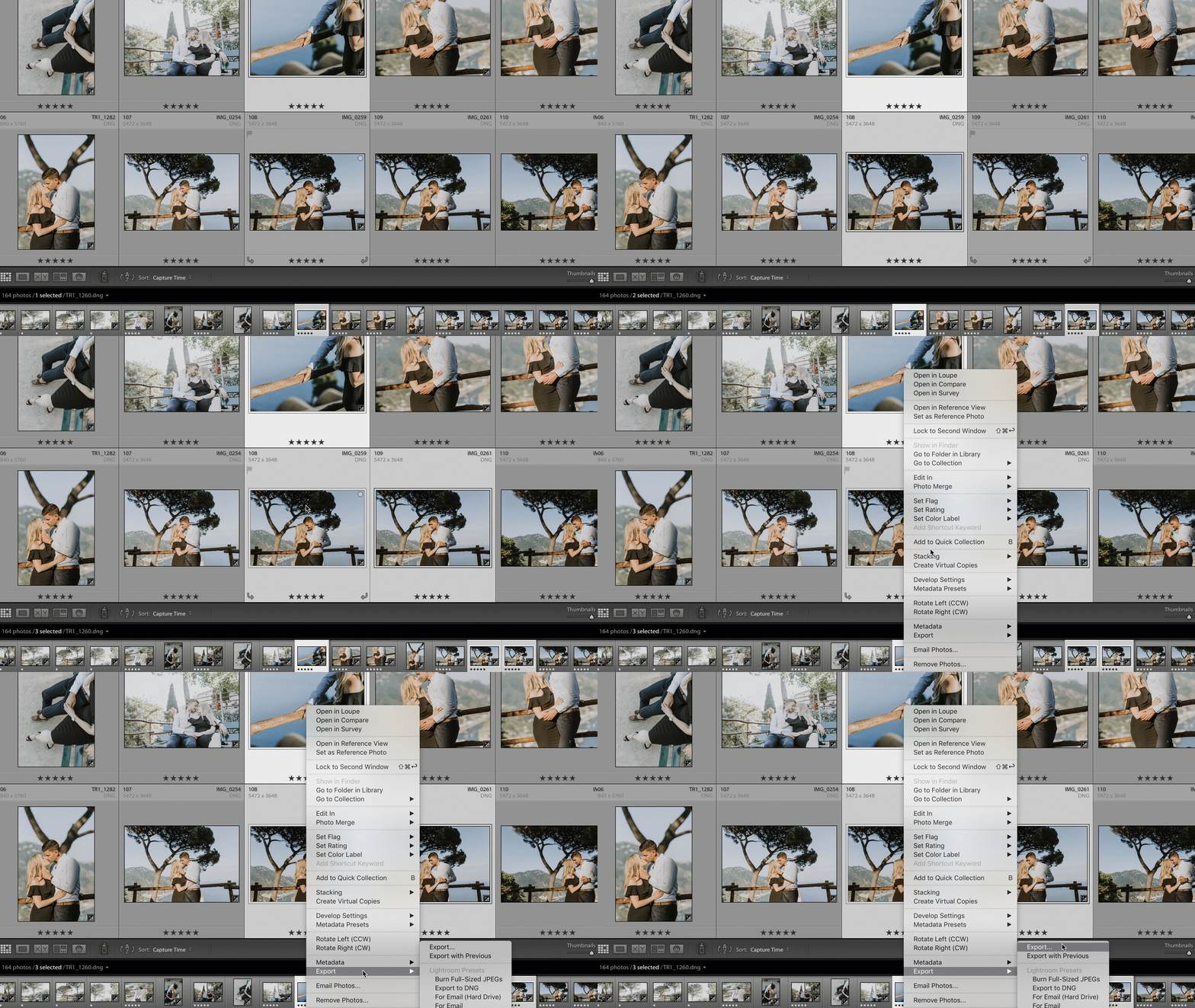
You can simply highlight/select any photo from your Lightroom library and right-click on the photo. From the pop-up menu select the Export option.
2. File and Export
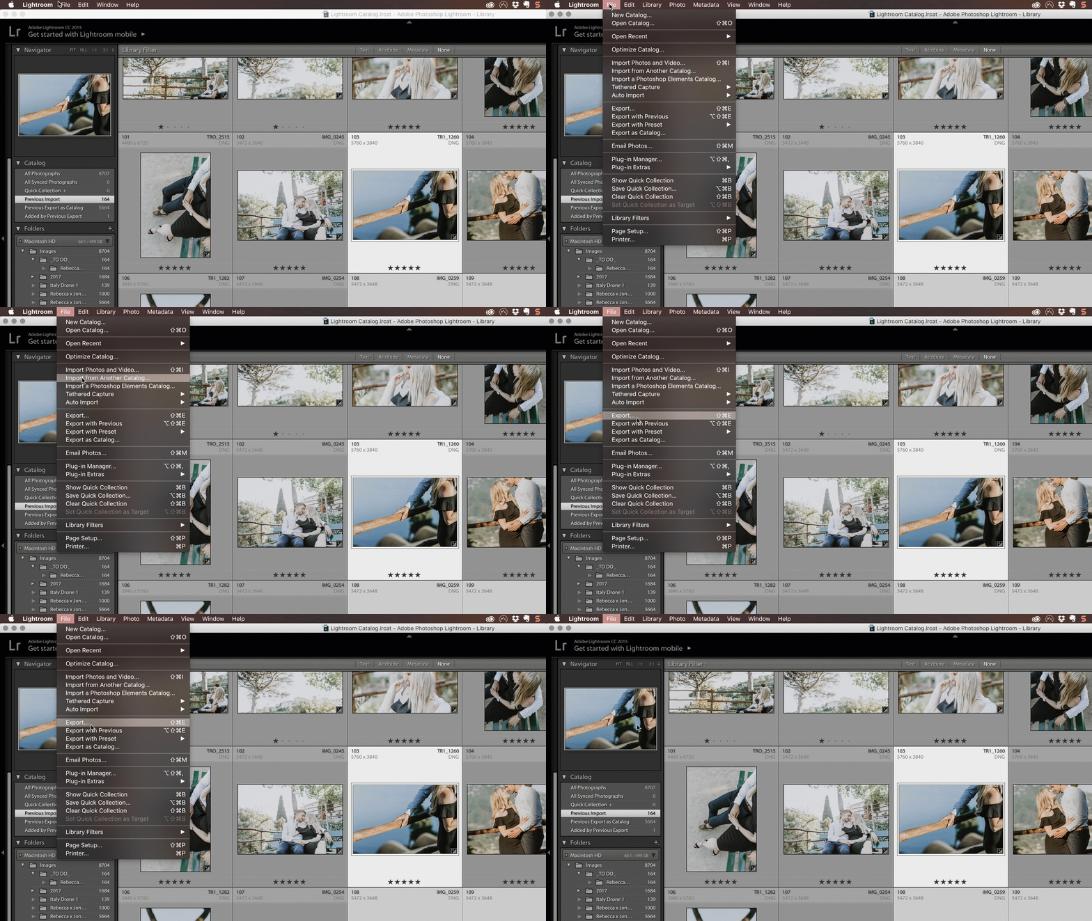
The second way is to go to File -> Export:
3. Using the keyboard shortcut
The third, and fastest way is to use a keyboard shortcut:
shift + command + E (⇧+⌘+E)
It doesn’t matter how you get there. Any of these will work, so choose the easiest one for you to remember.
Lightroom Export Dialog
Now that you know how to export the images for the web, we’ll cover the 4 sections and the various options to choose in the Lightroom export dialog to allow you to export optimized images for the web.
1. Each export can feature its own File naming. If you stick to the default option, your images will have the same name as the original files, but saved as a standard image type, like JPEG. You can also tick the “rename to” box and choose one of the many renaming templates that Lightroom offers to customize the exported images. In the File Naming, we renamed the image filenames to “Custom Name – Sequence” where the Custom Text is closely connected to our blog post title or blog post keywords.
2. In File Settings, you need to make sure that your Image Format is set to JPEG. This is the most web-friendly option. Your Quality should be no less than 55. Most photographers use quality between 70 and 80. Your Colour Space needs to be sRGB. This is the color space used by the web so it will render the best. DO NOT check the box “Limit File Size to:”. Checking that box would decrease file quality significantly.
3. Under Image Sizing, check the box Resize to Fit and select Width & Height. In the box W: H: specify W (Width in pixels) to 2048. Choose that number because it is big enough to look right on Facebook and is large enough for your wedding photography blog – the 2 places on the web where you’ll be sharing files most frequently. However, this number purely depends on your website layouts. If your theme blog images are 800px long edge, you can use any number between 800 and 1600. Double size is for retina themes. In the Resolution box, type 72 and make sure the box next to it is set to “pixels per inch.”
4. In the Output Sharpening section, check the box next to “Sharpen For”. You can select Screen from the drop-down box and set the Amount to High. Remember that web sharpening can get crazy fast and you need to check what works best for you.
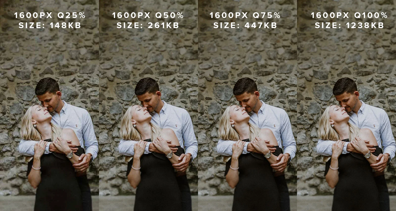
In a photographer’s dream world, we would always export images at maximum quality. In reality, we find out that maximum quality exports aren’t always needed. At web sizes, the differences in quality are often hard to perceive, and that means we can drop the quality slightly and reduce the file size significantly. As long as the images aren’t soft, your clients won’t know the difference between what picture you took and the image that’s displayed on your site.
This also applies to the colors of the images. Everyone’s screen is calibrated differently, so worrying about small color variations between an image in a browser and in your editing tool of choice is a waste of time, unless it ruins the image quality.
On the upper end of the quality scale, there are diminishing returns. The difference in perceived quality between 75% and 100% quality setting is hard to see, but it increases the file size significantly.
Given the above results, we would recommend selecting the export of 60-75 quality. It strikes the correct balance of quality and optimal image file size.
Further Optimization
One final step that can help drastically remove excess data from images, is JPEG Mini. If you have JPEG Mini pro, you can add the lightroom extension, so it will optimize them as you export, simple! If not, just run your freshly exported images through JpegMini. This will be the final step in creating fast web optimized images to keep your site’s speed up, and images looking great!
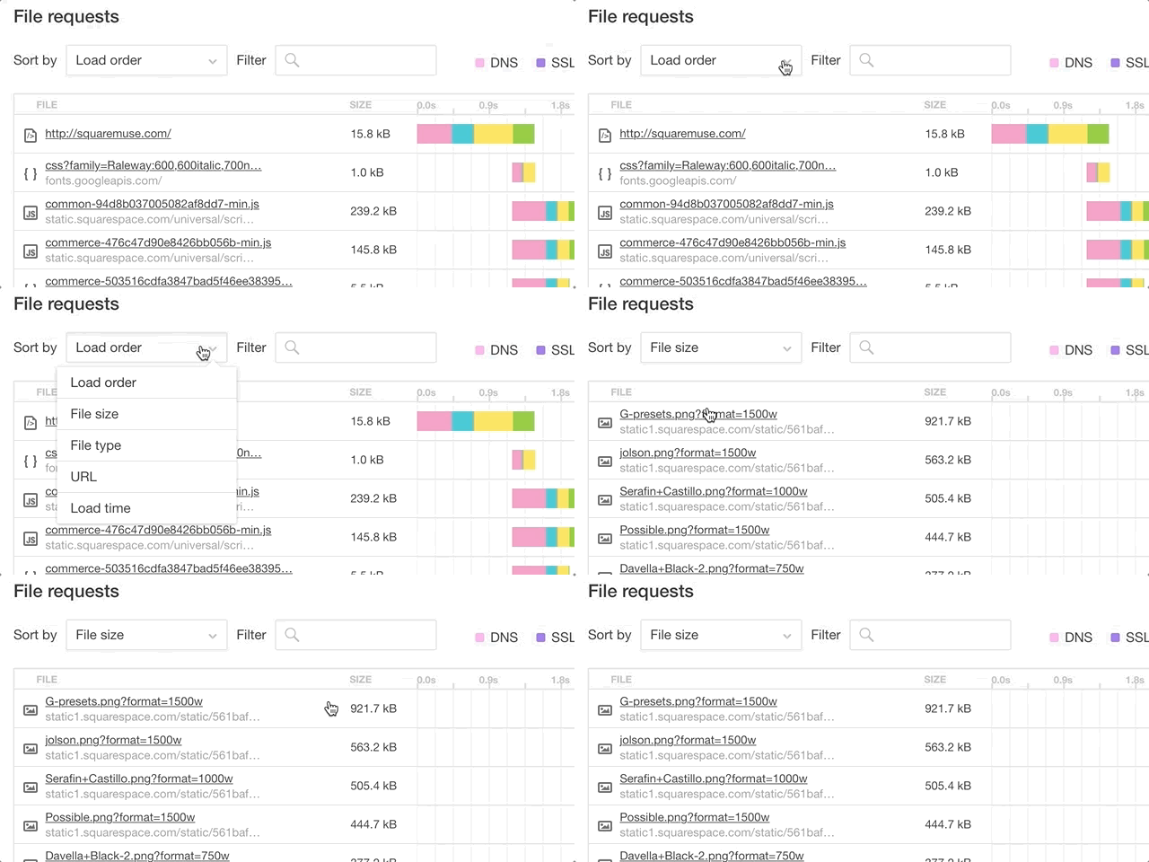
So that's pretty much it. Start with figuring out your image dimensions, then save them correctly for the web and optimize their size. If you already uploaded images to your site and want to know how to find the ones that are slowing down your page, go to Pingdom Tools, enter your site URL to run the speed test. In the results' chart click sort by Size to have the heaviest files shown first. If these are images, check their dimensions, sizing, and then adjust, optimize, and re-upload.
Adapting these steps will be a savior in the long run. And above all, it will make your site load fast, while keeping your images crisp, your viewers enjoying their experience, and most importantly, keeping your potential clients staying on the site.
Creatively Yours,
Squaremuse Team.


