Many Squarespace users often confess they have a love-hate relationship with the platform. While it’s extremely easy to use, offering a clean and intuitive dashboard, Squarespace also has some limitations. Since 7.1 version was released, there has been a huge debate among all experienced users out there: Is it worth making the switch? What is the new version like? How do I tackle the issue of manually moving my content-rich pages to a new (and unfamiliar) platform?
Rick Baleros: An honest Squarespace 7.1 review from a wedding photographer

image credits: ironandrye.com
We interviewed Rick Baleros - a wedding photographer who’s recently switched to 7.1. He will be sharing his honest review about the platform, as well as some tips for those who are still unsure to make the switch.
Rick is an advanced Squarespace user, having been on it for the past 5 years. For him, leaving 7.0 was a long-awaited decision. It came hand in hand with the need to upgrade his website look and with his brand evolving over time. Last month, he made the switch, using Squaremuse Osaka 7.1 Design Kit. The whole process was rather challenging (but fun) since it involved reviewing a lot of his work, deciding which makes it to the new website, and overall - learning a lot about Squarespace.
Rick Baleros from Iron & Rye Photography - Wedding Photographer
ironandrye.com - website built with Osaka 7.1 Design Kit
Tell us a bit about yourself and your business, Rick.
I’m a wedding photographer who grew up in Seattle, WA, but I currently live in Portland, OR. Since 2015, I’ve gotten the best of both worlds as I’ve been able to work out of these two amazing cities that I’ve grown to love and call home. I have also been able to travel across the US to photograph some amazing weddings. Much like my brand, I’m down for a good adventure and I won’t ever turn one down. When I’m not jet setting or driving up and down I-5, I’m a behavioral counselor, Volleyball coach, and grad student. Life is busy and sometimes crazy, but I wouldn’t trade any of it in for something simpler.
How did you start out with Squarespace (and Squaremuse Designs)?
I came to Squarespace in 2015 after leaving another platform, because at the time I wanted to explore my brand and web design (to some capacity). What made that exploration possible with Squarespace, were the pre-built templates we are all familiar with in 7.0 version. For someone who was new to the elements of branding and design, the pre-built templates were a no-fuss kind of deal. Think of it as a boxed cake mix – you get all that you need, while still having to put in some work to get the desired product. What more could I have asked for at the time?
At some point though I was ready to push the envelope as a photographer who designed their own website. After changing my template constantly over the years, it served the purpose of helping me solidify the brand that I’m known for now: daring, bold, and adventurous. For me, it was about taking a risk and making it worth it, which is why I took the risk in 2017 to use Porto from Squaremuse.
That was a game-changer for me. For the first time as a business, I felt that I had the website I always dreamed of. In addition, Porto pushed me as a photographer in regards to how I presented my brand and the content I produced. It also pushed me as a designer, as I learned to use Squarespace in a more intricate way. After installing Porto, I looked at Squarespace differently, as it became a vehicle for my business. It truly was a representation of my clients, my work, and myself.
Why did you decide to switch to Squarespace 7.1?
Now, what drew me to Squarespace all those years ago wasn’t just the opportunity to explore, but it was because of the ease of it all. To this day, I still believe that Squarespace has a friendly interface that users can navigate around, regardless of their knowledge of design. While that’s the case, there did come a point where 7.0 with Porto created limitations and roadblocks for me. Porto is one of the templates built on using Indexes and while I love me some parallax, the number of Indexes I created made my back-end system clunky and cluttered. Not only did I not love my dream website anymore, but by the end of the 2018 wedding season, I stopped updating my website because I was stuck and overwhelmed.
With that feeling, I knew that I needed a breath of fresh air. I also knew that my website needed an overhaul. To me, it was either switch to 7.1 or leave Squarespace altogether. I decided to stay.
Squarespace, as I mentioned, helped me build a brand. When I looked into 7.1 more intently, I found that what drew me to Squarespace all those years ago is exactly why I chose to stay. From what I saw, 7.1 was built with the designer in mind. By allowing users to have access to all those great features, the design process felt endless and it gave me the opportunity to explore again.
I was lucky in choosing to do my redesign during quarantine because I had more time on my hands, but also because Squaremuse launched Osaka 7.1 days prior to that. While I wanted to stay with Porto, I knew that this redesign, breath of fresh air, and overhaul needed to happen in all aspects.
Tell us about your experience with SS 7.1 and Osaka 7.1. How do you find them so far?
The actual implementation of Osaka 7.1 took me a couple of hours. Squaremuse Team knocked it out of the ballpark with their walkthrough guides. I didn’t expect any less of them, because I could say the same from when I installed Porto years ago. I spent a majority of that time familiarizing myself with Squarespace Dashboard. After getting used to a few changes, I’d say that the dashboard is more streamlined to the design process - certain style aspects are grouped together, which helped me in getting my website up and running sooner. There were a few changes in the Design Panel that I had to navigate through. Working with color palettes (which are new) and fonts is a bit different in 7.1. When it comes to changing fonts, you’d make “universal” changes, set your global font styles and then assign them to different elements on your site.
Now, to get my website to a place of a live launch, it took about a week, a couple of headaches, a moment where I put my head down and power cried for five minutes, because I just needed that release. Anybody else feel me on that power cry? Nope? Ok … haha.
None of that was due to the installation of Osaka, though. It had everything to do with redesigning my brand on a new platform with a more sustainable system of running a website. Moving over to 7.1 really forced me to think about how I wanted my brand to grow, as I moved into a new season of being a photographer. Ultimately, it meant that I left some galleries from my earlier days on the old website.
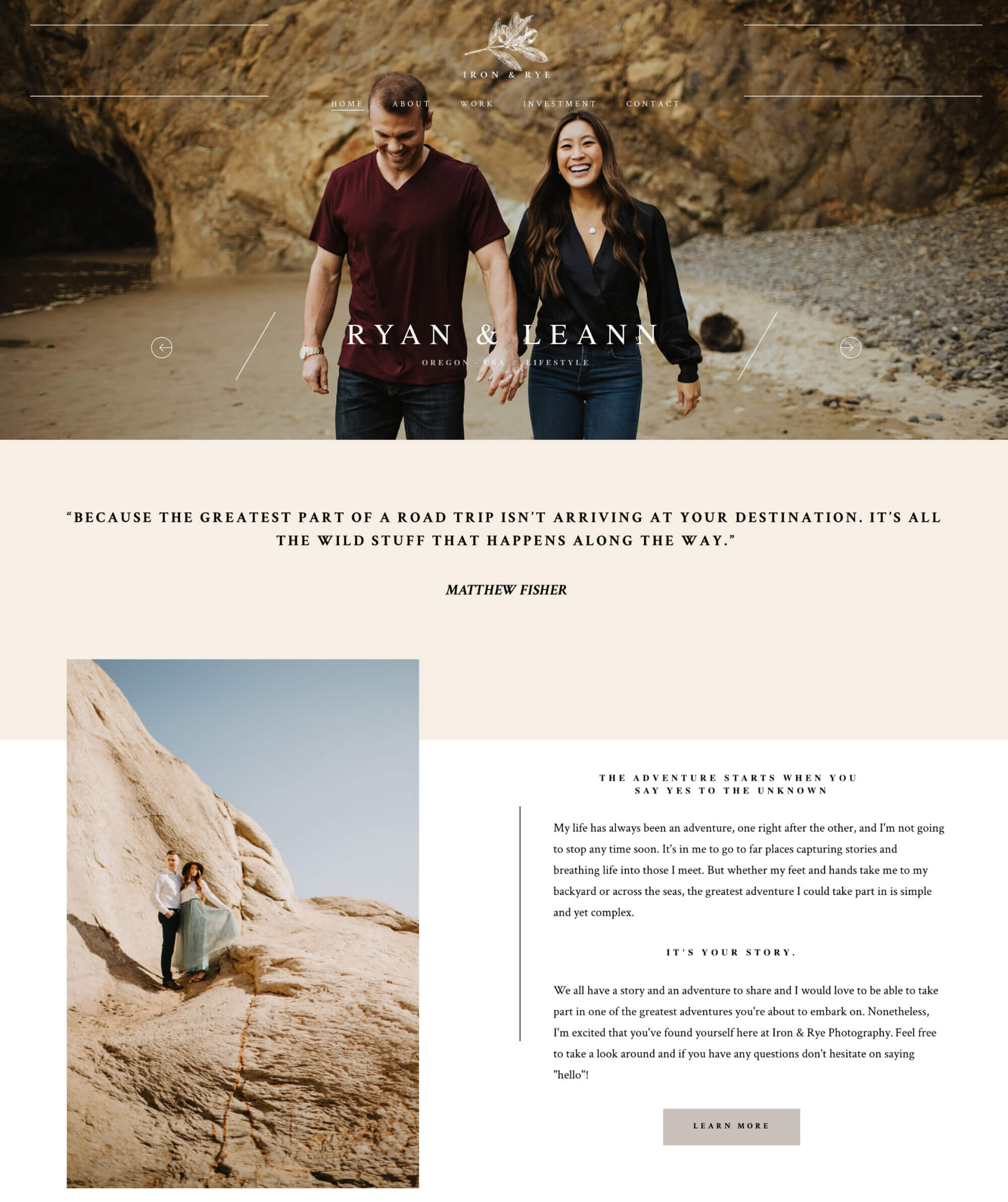
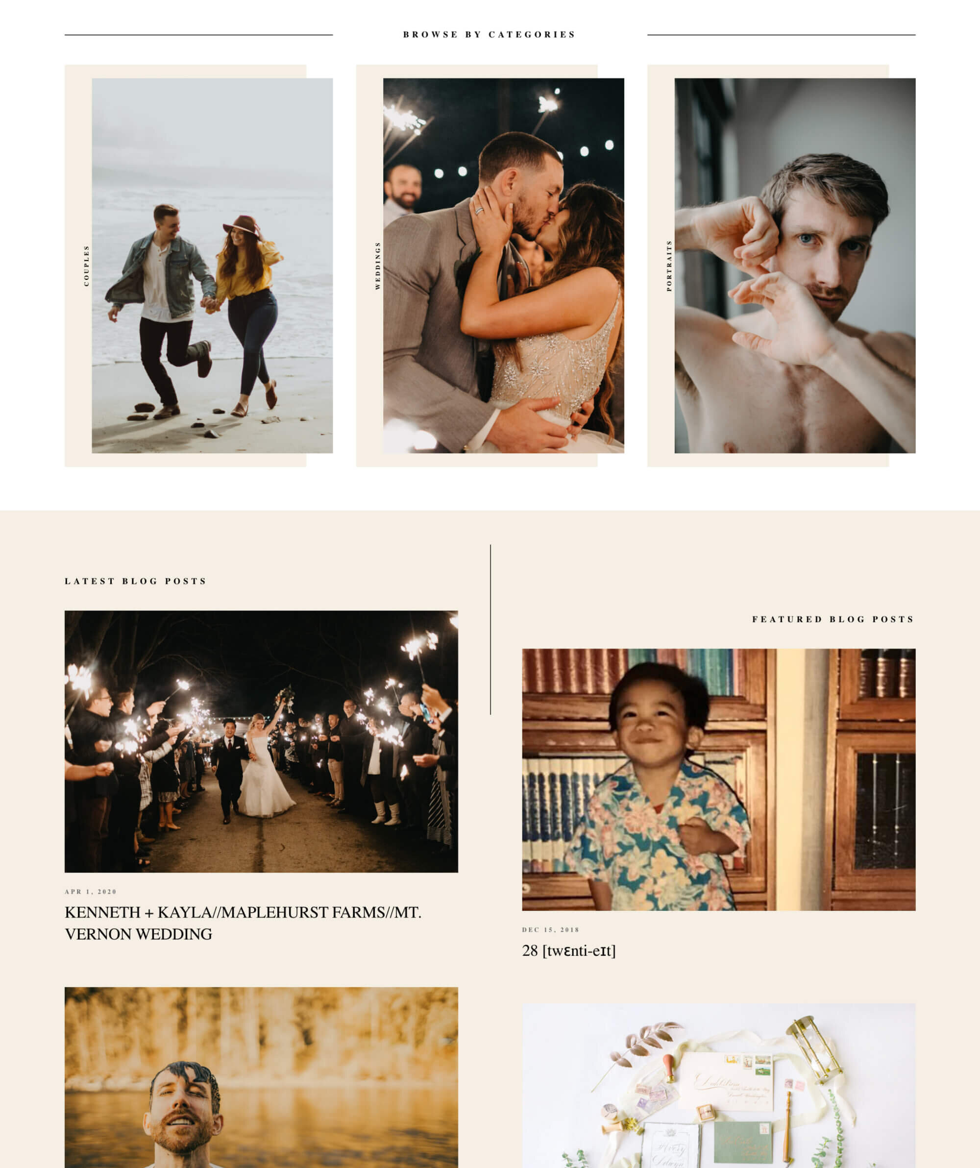

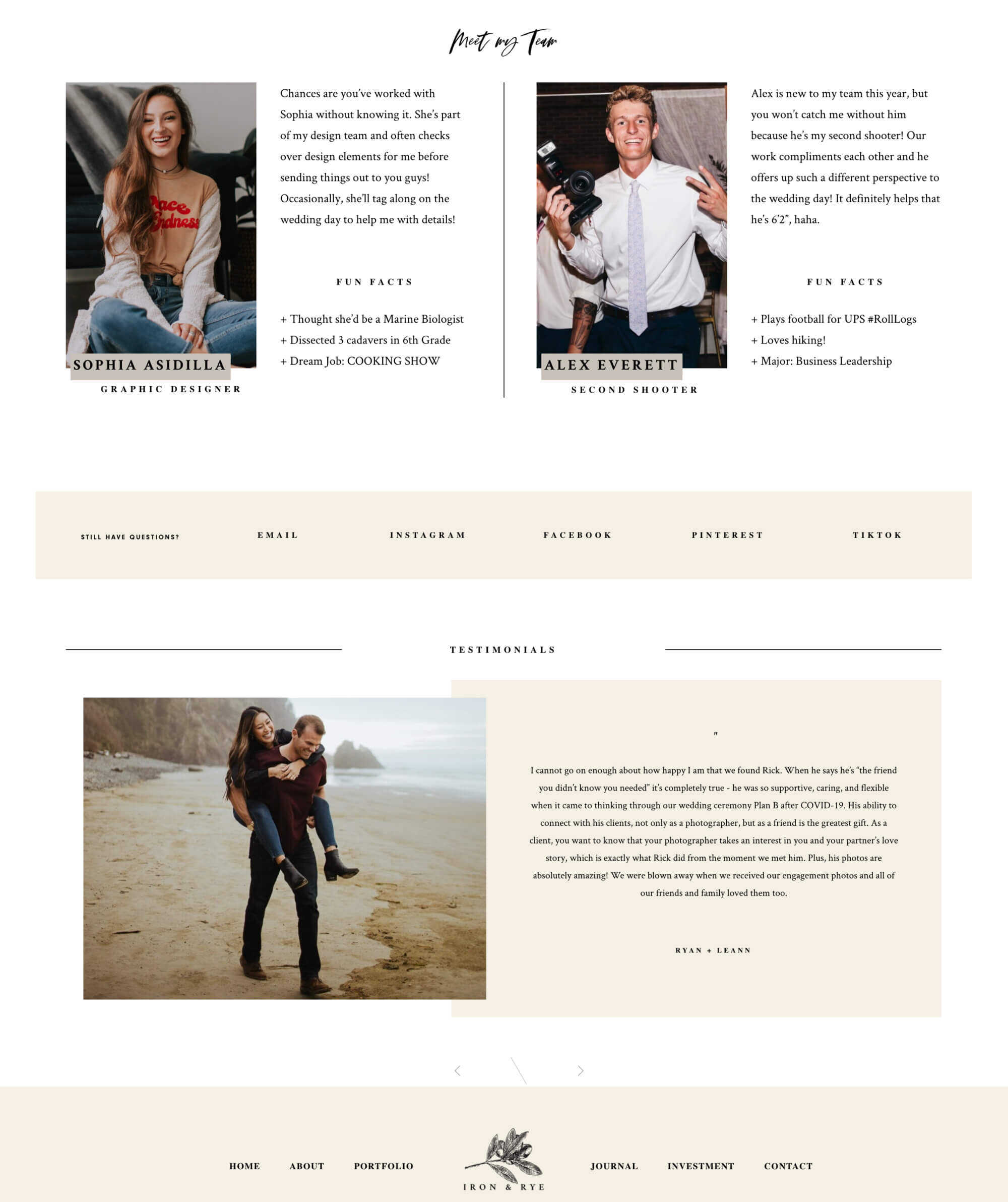
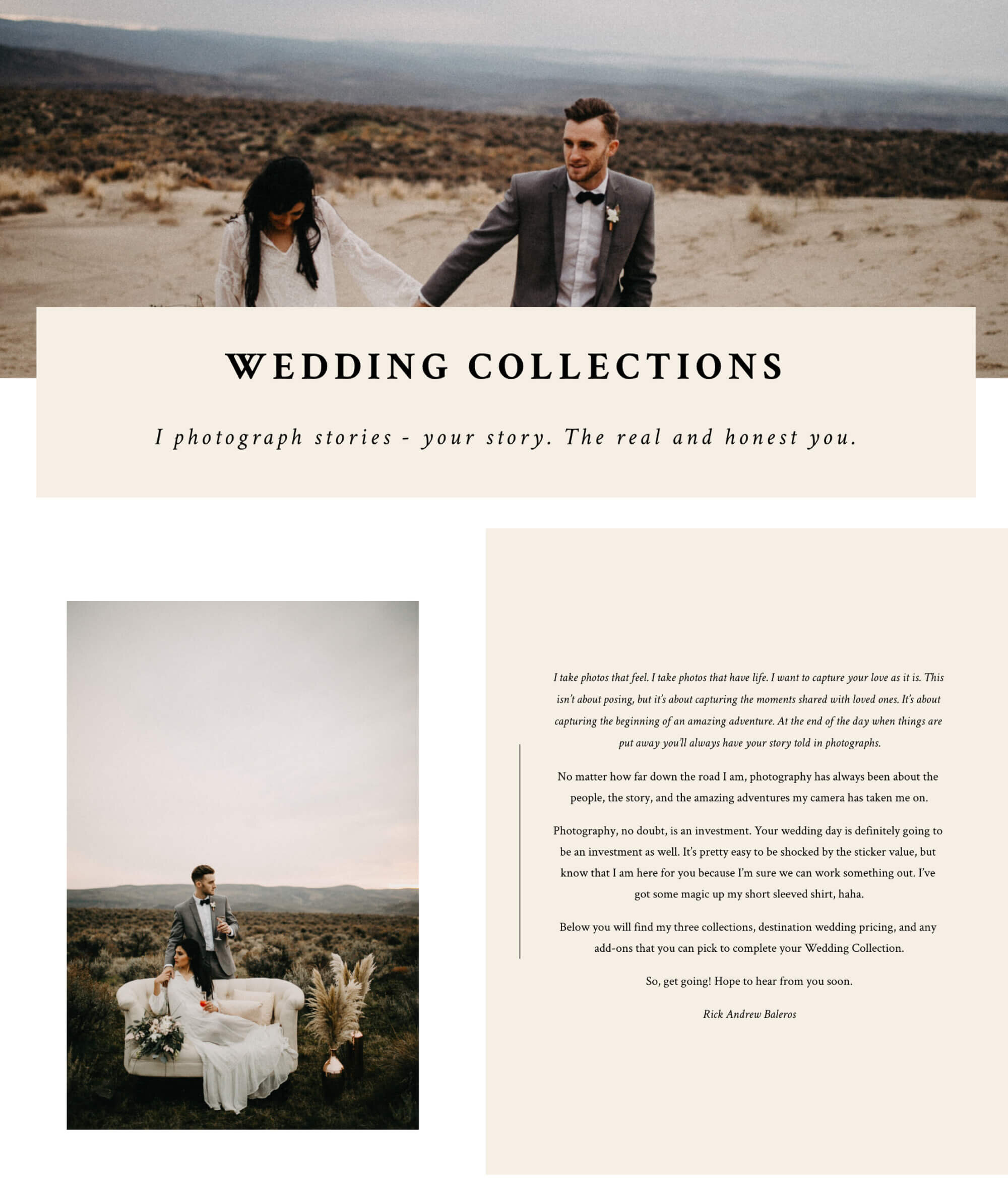
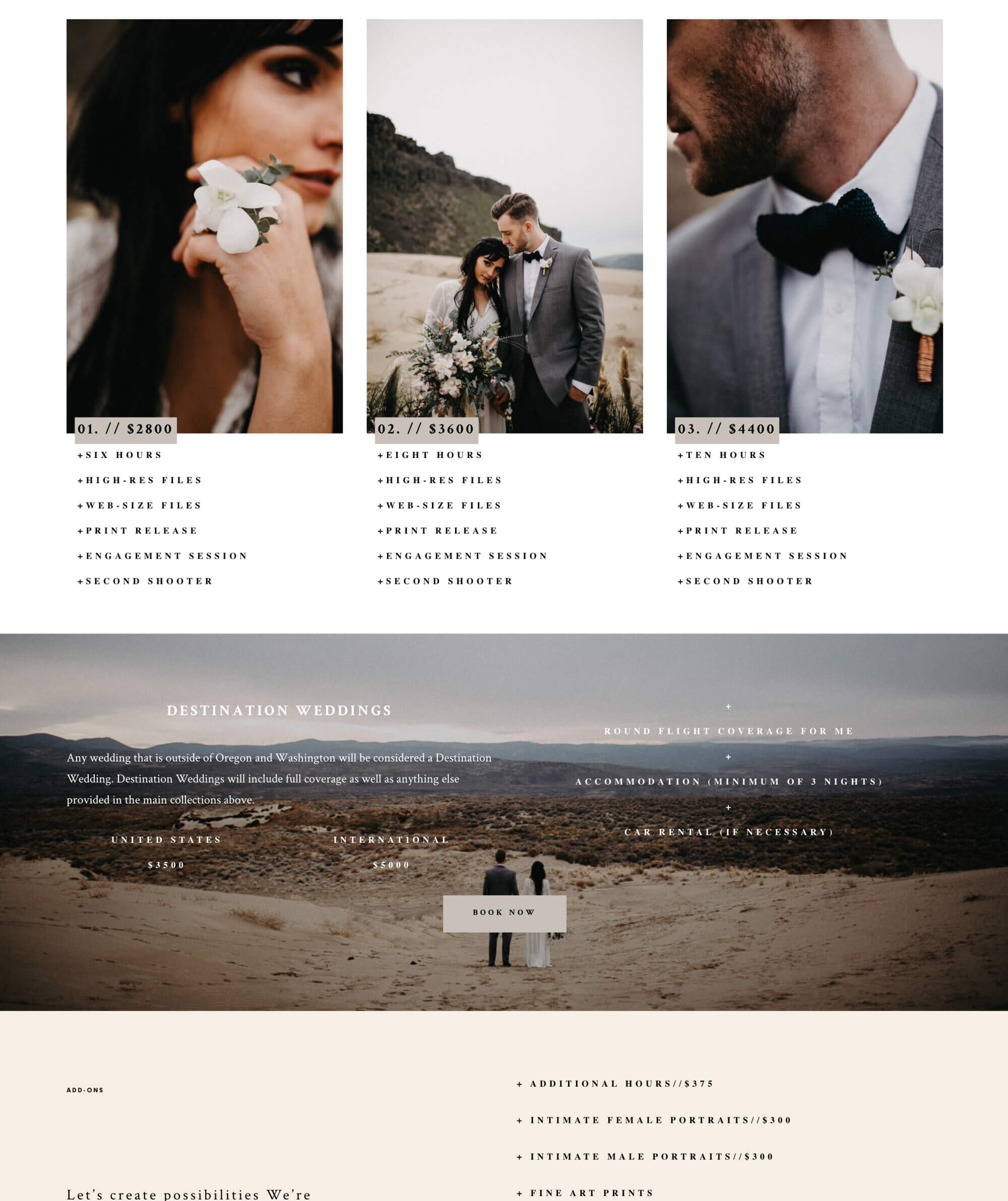
Now, when I put in those final touches, what I had in front of me was a website that felt a little bare. There were galleries missing. There were blog posts that will never be read again. Making a new website meant leaving behind one that showcased the years of hard work to get where I was. As I reflected on that, before announcing my new website on social media, I knew: the whole week that I left behind was totally worth it. As a photographer, I’ve grown over the years and so has my brand. It was time that I let my brand be shown off in new ways. I know that I’m really happy with where I’m at.
What piece of advice do you have for those who are unsure about switching to 7.1?
I know some of you are probably still on the fence about 7.1, just like I was. If I were you, I’d take the risk and dive into what you’ve created and allowed that to come through on a new website. In my opinion, these are a few things you should consider before making that jump:
Version 7.1 requires a new subscription to Squarespace. At this moment, there isn’t a way to migrate your website from 7.0 to 7.1 and for me, to start the installation process of Osaka also meant starting a free trial to activate 7.1. I chose to do my redesign close to the renewal of my 7.0 subscription. I obviously decided not to renew it and to invest in the 7.1 website instead.
If you’re looking to stick with Squaremuse (which you should), the current design template they have is Osaka. I know they are working so hard on getting other designs out, but if there’s one in particular that you’re looking for, it would be a matter of waiting for that design to be released.
Version 7.1 is a bit more hands-on. Like I said - with 7.0, the pre-built templates are kind of like boxed cake mix. You have a lot of the important ingredients already at your hands and all you need to do is add eggs and water to top it off. Comparatively, version 7.1 gives you all the ingredients in some form, but it’s a matter of how you want to use them and whether you even want to make a cake. You have more power and freedom to experiment. So, if you’re looking for a website that just does it itself, then 7.0 is perfect! If you’re ready to be more hands-on with your design, then 7.1 is going to be that next step for you.
Thanks for coming along and reading about my journey! It’s been a fun and wild one for sure. I hope it helped some of you think about where you’re at in your business and why you’ve chosen Squaremuse templates. Who knew that years ago I would even be asking myself these questions about design, branding, and systems that make a website designer’s life easier.
I would love to leave you with this food for thought. My business motto is, “Take a risk. Dare to be different. Make it worth it.” I took a risk in redesigning my website. I am in love with it and I can’t be happier with what I’ve created. The whole process brought to light the fact that my brand had outgrown where it was on 7.0 and it also showed me that it was time to move on and move forward. It’s your turn now. Go take that risk. Sit down with what you’ve created and give it space to continue growing. Best of luck with your redesign process!
***
As Rick mentioned, we are working on a new batch of design kits and custom elements for Squarespace 7.1 Want to get notified once they’re out? Sign up here and we’ll send you exclusive demo previews and release dates, as soon as they’re available. If you are looking to read a more in-depth overview of 7.1, learn about its features and dashboard, check out this article.
Creatively yours,
Squaremuse Team


