Do you feel like you are the one serving your website, when it should be the other way around? While it is true that your site is a work in progress and does require your attention - this should not feel like a full time job. The ultimate role of your website is to convert visitors into paying customers. YOUR role is to strategically change and adjust it, so that it serves it’s primary goal - getting you booked. In today’s article, you will learn 3 clever ways to tweak your website, so that that your photography business starts getting more inquiries immediately.
Change these 3 things on your website to save your photography business

image credits: savannahmeikamp.com
[FREE WORKSHOP + GIVEAWAY INCLUDED - SCROLL TO BOTTOM FOR DETAILS]
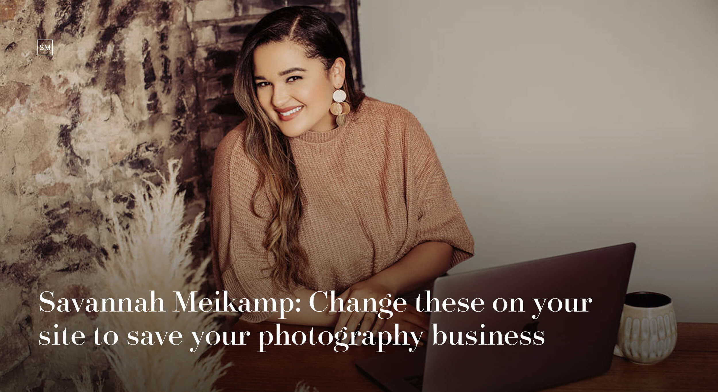
This is a guest blogpost by Savannah Meikamp. Savannah is a brilliant educator who helps fellow photographers take their business from being broke to booked out - a feeling way too familiar for creatives during the pandemic. Given her first hand experience with photography, marketing, and business, Savannah has cultivated a unique perspective to coach others who also want to grow their photography businesses. She runs a wedding photography business out of Sioux Falls, SD, together with her husband, Luke. She has also founded an amazing Facebook community for Wedding Photographers called “Broke 2 Booked out”, where she shares valuable advice and tips on running a successful photography business.
Luckily, Savannah and Luke agreed to share all their secrets with us! They admit that initially social media was driving most of their sales, but it was a well-done website that increased their overall bookings and even let them double their prices.
Keep reading to learn about the 3 things that made them go from having zero purchases on their website to being completely booked out, mainly through inquiries on their site.
An Engaging Homepage
You never get a second chance to make a first impression. Do you agree? Your homepage is what your visitors first see when they land on your site, and if created right - it can be your best tool to drive conversions. So make sure it’s a good one. In fact, building an engaging homepage is the first step towards booking more clients through your website. You want your homepage to appeal to those who see your website for the first time, but also intrigue those who visit your site often.
Essential Elements for your Homepage:
A header with a hero image that represents your ideal client and what they value in photos
An easy-to-read tagline that sets you apart from others in the industry
An ‘About’ section where you can connect with visitors by explaining your ‘why’
A portfolio section to highlight recent galleries or blog posts
A Client Journey
Your website is more than a means to provide logistical information to a potential client, such as investment details or contact info. It is a place where your visitors see your work for the first time and can get an idea of the journey you’re about to share with them. Thus, your website provides the perfect opportunity to take your couples on a ‘tour’ of what it’s like to work with you. An easy way to do this is by making your site easy to navigate so that it guides visitors to strategic sections and pages that you want them to land on.
How to create a purposeful customer journey on your website:
Setting up your client journey begins with your hero image and tagline. Be appealing to your ideal clients, by showing imagery that represents them and what they value. Present yourself as the solution to what your ideal client is looking for.
Use testimonials from past clients to position yourself as an authority that delivers the best experience on the market.
Always make sure you have a clear CTA (Call-to-Action) that tells your visitors what to click on next. The easier it is for a potential client to navigate your website and find the information they’re looking for, the more likely they are to contact you.
This takes us to the third important aspect of a highly converting website.
Make it Easy to Contact You
If you want to book more clients for your photography business, you have to make yourself available for them. Be easy to connect with. Create a simple ‘Contact’ form in addition to our ‘Inquiry’ form and you will notice how you start receiving significantly more inquiries. Most photographers create ‘Inquiry’ pages that address the needs of one specific type of client (weddings, engagements, family, etc.). Having a contact page that is less specific and more open-ended encourages more inquiries. Some people prefer to just get in contact with you before sharing all the details about their wedding.
Include buttons that link to your ‘Contact’ or ‘Inquiry’ forms on each page and blog post. If getting in touch with you is a hassle - your visitors will likely give up. Make it an easy-breezy process and watch your inbox buzz with requests.
These 3 simple website changes helped Luke + Savannah’s business grow. They now run a team of associate photographers and continue to expand into other Midwest locations. How cool is that?
Want to learn more website tricks and pick Savannah’s brilliant brain some more? We’ve got great news! She is hosting a free 5-day challenge on March 15-19, to help you create a new and improved website that gets you booked. You will learn how to convert your dream clients with a strategic home page, gorgeous portfolio, the perfect thank you page, and so much more.
The best part about the workshop? It will be hosting giveaways every single day. One of the prizes is a Squaremuse website Design, and you don’t want to miss out on that!
Sign up for Savannah’s FREE challenge here.
Creatively yours,
Squaremuse Team


