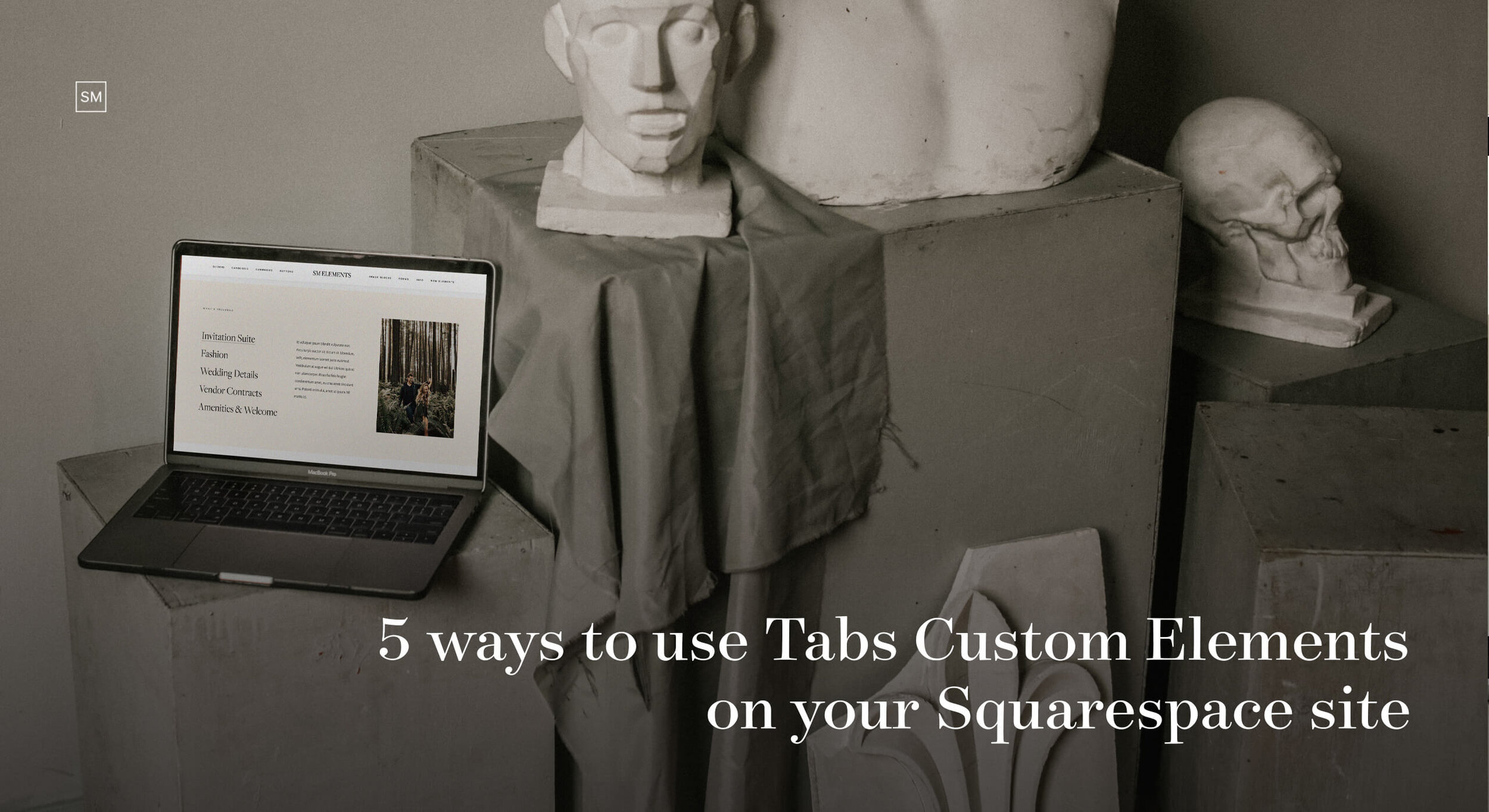
Tabs Blocks are beautiful Custom Elements for Squarespace that will help you optimize your site layouts, by presenting complex information in a straightforward and easy to grasp manner. Whether you plan to present different packages, describe your services, or showcase client testimonials - Tabs are an excellent choice. In today’s article, we will show you 5 ways you can use them to structure your content better, add subtle movement to your Squarespace 7.0 or 7.1 site, and make it more engaging for your users.
5 ways to use tabs in Squarespace to organize your content

Planning to describe a tedious process or list numerous benefits of hiring you? If you don’t want to leave out any crucial details, or worse - bore your site visitors with long text paragraphs, you need to break up the information into bite-sized sections or categories that your users can switch between. This way, your content will be much easier to skim through and digest, and there is a higher chance they will actually read all the important details. Keep scrolling for 5 ways and real examples of how you can use Tabs Custom Elements on your Squarespace 7.0 or 7.1 website and make it more fun and interactive.
1. Showcase Testimonials
Besides our well-known Testimonials Sliders, you can use Use Tab 01 Custom Element to showcase kind words from clients in a compelling way. Or best, use both to present different testimonials from different clients, on various pages.
Shop Tabs 01 for Squarespace 7.0
Shop Tabs 01 for Squarespace 7.1
Imagery by Jeremy Chou
2. Present Packages and Offerings
If you’re looking to present multiple packages or different price categories on your website, Tab 03 Custom Element is perfect for that. Have your visitors seamlessly navigate through the horizontal tabs, persuade them why you’re the right fit, and top it off with a strong CTA for more impact.
Shop Tabs 03 for Squarespace 7.0
Shop Tabs 03 for Squarespace 7.1
Imagery by Karolina Grabowska on Pexels
3. Address clients’ fears or list benefits
Tabs 02 Custom Element is perfect to address clients’ fears and pain points or list the benefits of hiring you. Add them to your Experience pages, Investment page, or use them on a more focused landing page, to present a specific service or product. The way the categories are emphasized on the left size lets your visitors easily switch between tabs and read what they relate to the most.
Shop Tabs 02 for Squarespace 7.0
Shop Tabs 02 for Squarespace 7.1
Imagery by Greg Petersen
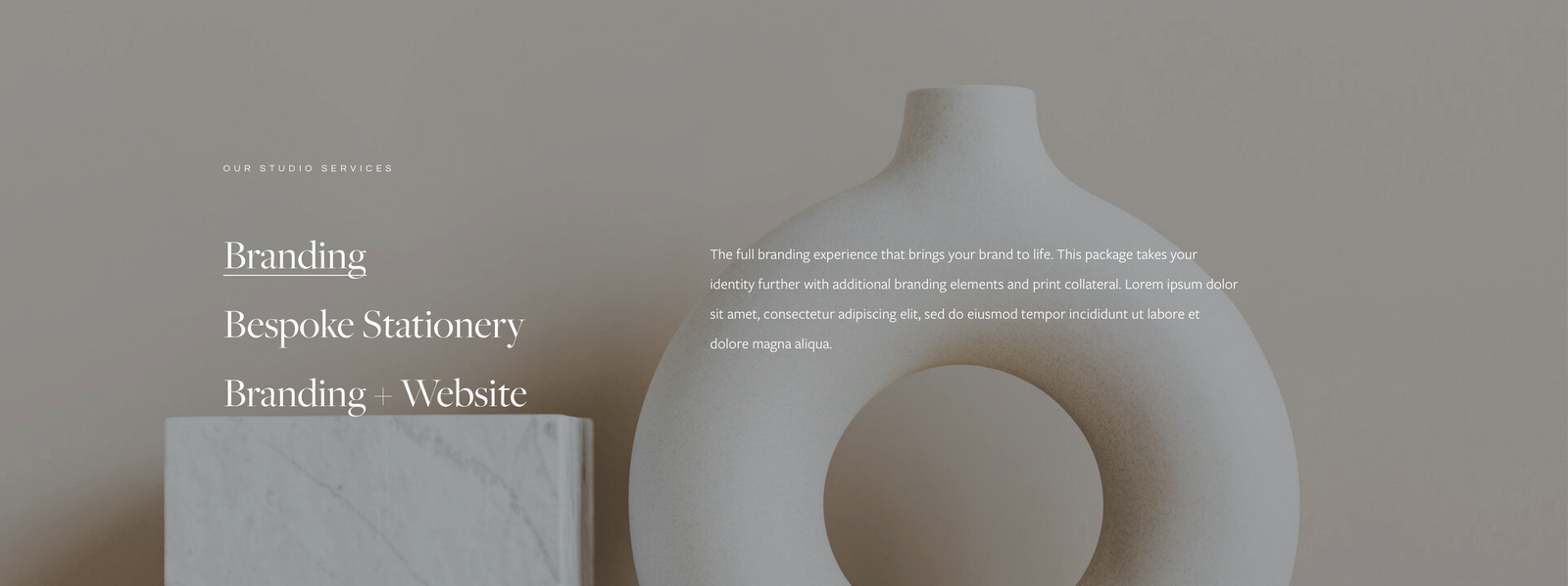
4. Describe your Services
Use Tabs 02 Custom Element to share a sneak peek of your available services on your homepage, to keep it light, but share enough information to intrigue your visitors. Add a CTA at the bottom to invite them to read further on a separate Services page.
Shop Tabs 02 for Squarespace 7.0
Shop Tabs 02 for Squarespace 7.1
Imagery by Karolina Grabowska on Pexels
5. Show your process
We’ve got a wonderful example from our client Jessica Murko, who used Tabs 03 Custom Element to gracefully present her process and steps. Keep it sweet and short, add essential information to have your users engaged, and if you want to share more - you can always guide them to a more elaborate “How it works” page.
Shop Tabs 03 for Squarespace 7.0
Shop Tabs 03 for Squarespace 7.1
Showcase by Jessica Murko
~
Are you planning to get one of these beautiful, interactive, and super functional elements for your site? We’ve got a surprise for you! Get 15% off all Tabs Blocks for Squarespace 7.0 or 7.1 with code ELEMENTS15.
Creatively yours,
Squaremuse Team
Did you enjoy this article? Pin it to Pinterest!


