It is hard to be a nerd. If you want to take a good photo, there are so many things to be taken into consideration: what kind of light you are dealing with, black&white or color, vertical or horizontal, analog or digital, natural light or flash, what is the perfect preset, what is the best lens, how about composition? With experience and once you find your voice and method that works for you, these decisions come easier. The irony is that as you lead a photography business, not only do you have to be a good photographer, but also marketer, communicator, designer, organiser and you can’t be an expert in all of those fields.
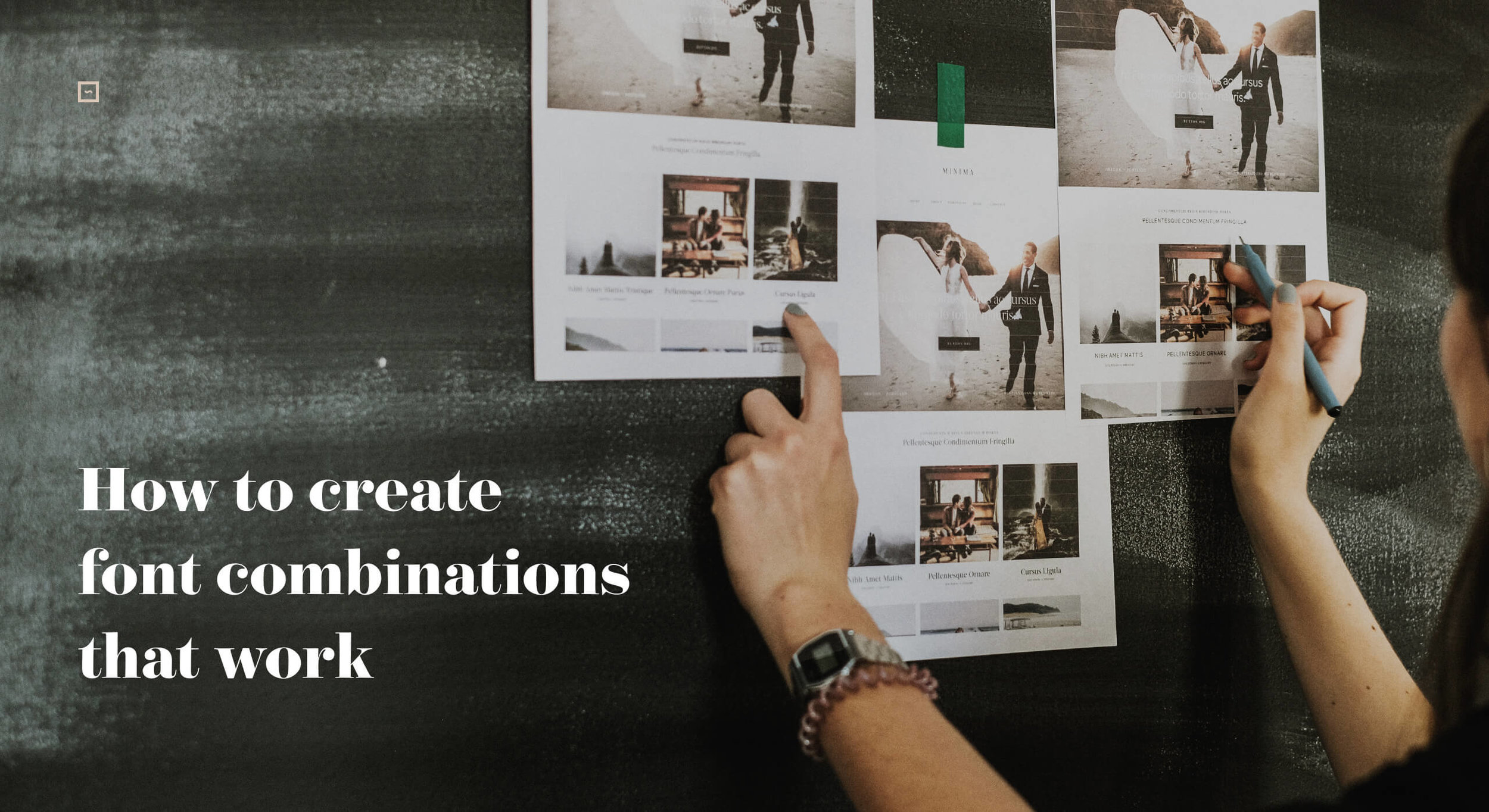
How to find the perfect typography match for your imagery
Today we want to talk about typography, and specifically type for your website. A good typography choice can elevate your overall look/aesthetic, and get your photography business to the next level. Simultaneously there are so many things to consider in order to reach the desired effect: letter spacing, sizing, shrift combo, colors. On top of it all Squarespace offers a multitude of font options, through Google fonts and TypeKit, that makes it even harder to make the best choice for your own brand identity.
Finding a perfect combination between H1, H2, H3, meta and body fonts is tough, particularly when you want them to carry across your message in an effective way but not compete with your images. How to select typography that flows with your imagery? How to find typography that is peanut to your butter? Donut to your coffee?
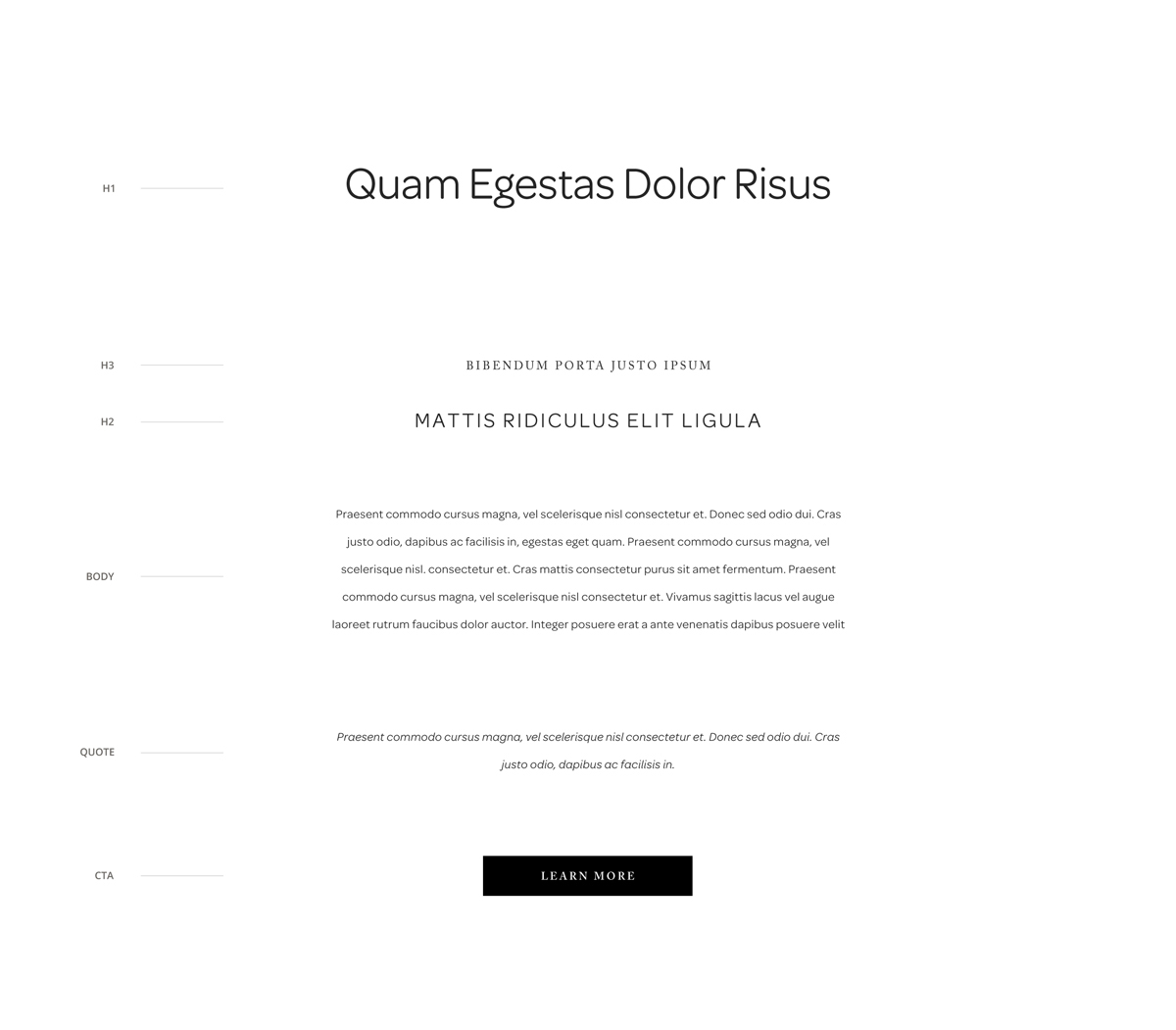
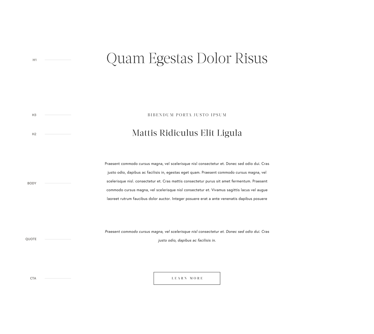
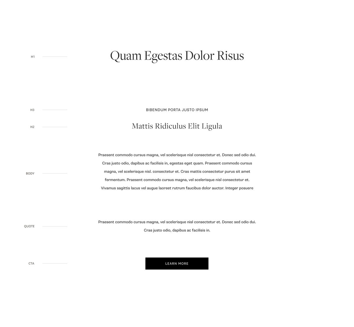
Luckily, we are the creative nerds who love Typography. Moreover, we are more than happy to share with you some insights on aligning your fonts with your photography style. First thing, which is helpful and where our team starts this journey is to put all hierarchy type on one canvas (we recommend to work in Photoshop for this or directly in your Squarespace account).
You can take as example one of your blogposts and use its title, a subtitle, a tagline, a paragraph, add an image to the mix and a call to action button, for example Read More. Then start applying different font styles to Main Title as H1, Subtitle as H2, tagline as H3, body font for the paragraph and meta font for your button. This way you can see how all fonts come together in the combination and you can start adjusting their settings: size, letter spacing, line spacing, color. The hierarchy of fonts gives you a hint which font should stand out more and be more prominent in the mix. The most legible should be your body font since it's the font your users will need to read in blogposts and it should be comfortable for longer reads. Meanwhile the most eye catchy fonts should be your H1 and H2. Meta fonts and H3 are secondary, accent fonts. These are support fonts and should not detract attention from main messages and specifically from images.
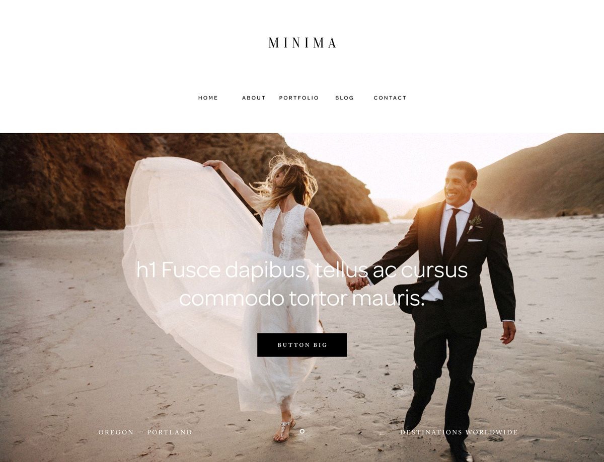
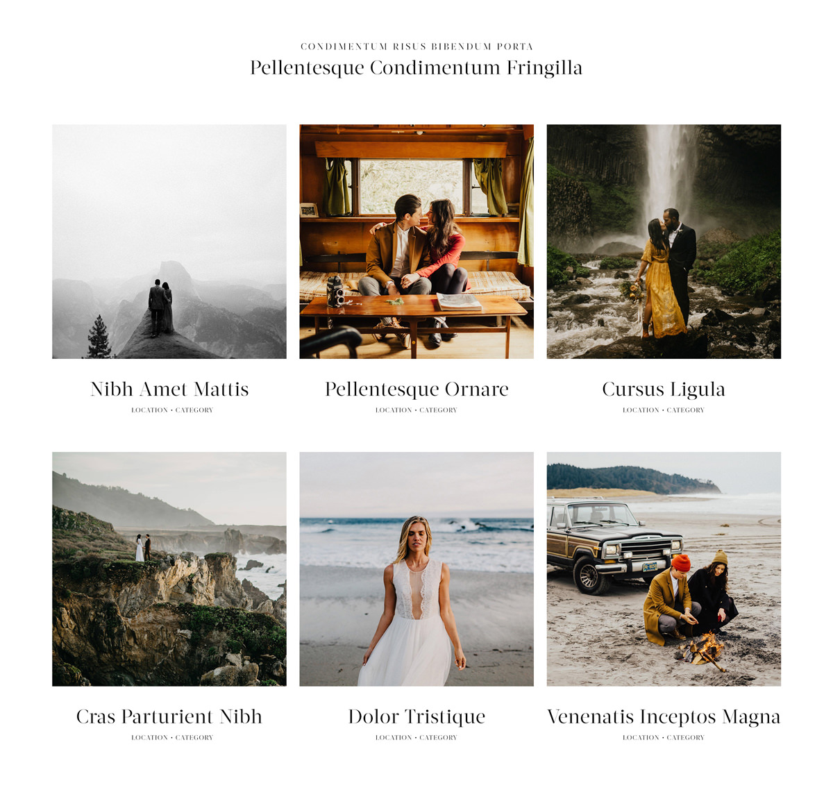
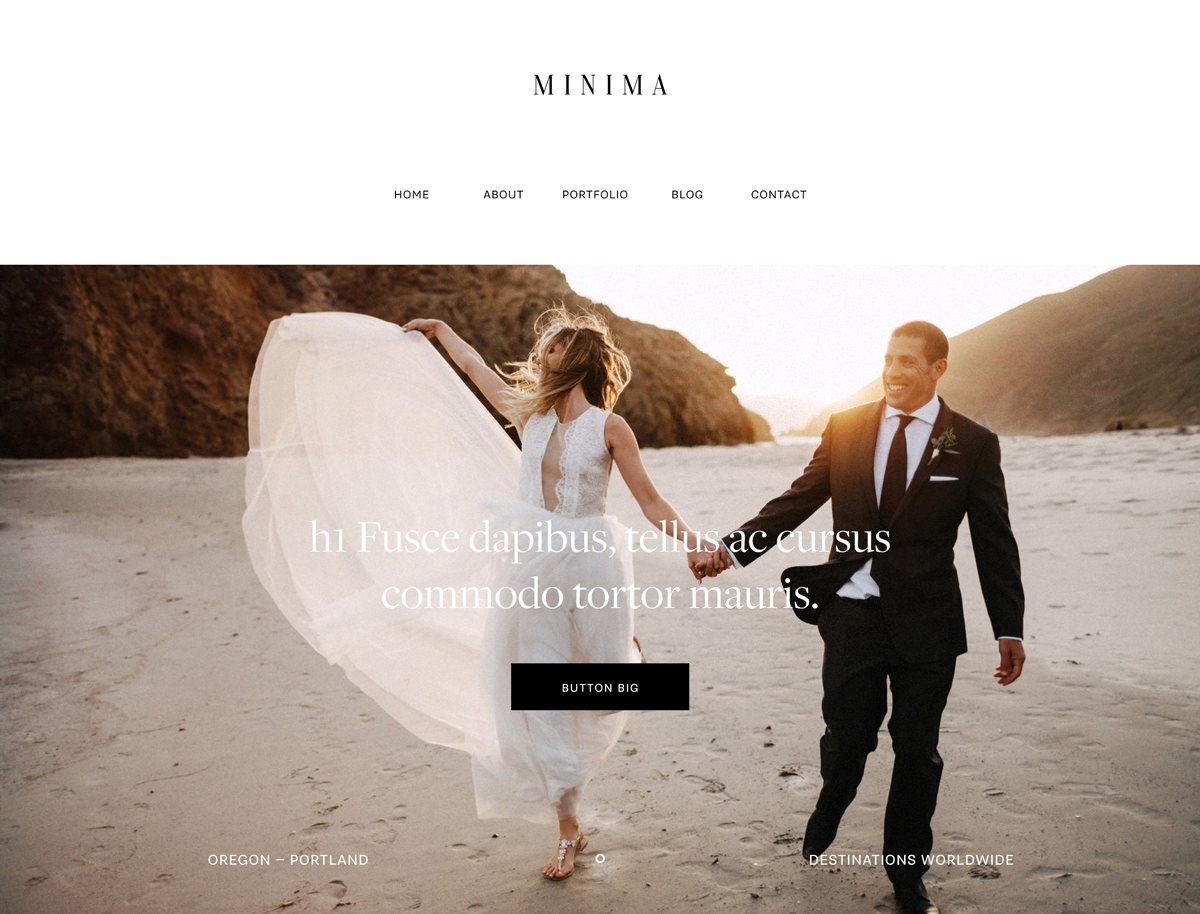
We hope this gives some more insight in our approach. To exemplify the above we’ve taken our Minima Design Kit, which by default has an edgy and raw feel due to its specific font selection: it’s reserved but stands out, trend setting but not mainstream, and it’s elegant and clean for a specific client niche. Based on Minima homepage we will show how to create font combinations and how different combinations can change the visual perception of the overall identity and visual voice.
Modern
This mix is a play of several Sans Serif fonts. Sans Serifs are fonts that are more modern, casual, informal and friendly than serif fonts, which tend to be considered classic due to their historical origins. Selecting a combination of 2-3 Sans Serif fonts will confer your website a bold and clean look, it will showcase perfectly your modern imagery.
Editorial
Based on Serif fonts, this combination fits best a lifestyle and editorial look, with airy and fresh feel to their photography. The small strokes projecting from the main stroke of each character (the serif) makes the letters stand out clearly in a classic elegant manner. Brands with watercolor elements or light illustrations will fit great with this combo.
Combined
The mixed combination consists of a good balance between the Sans and Serifs- this shrift fusion creates an attractive contrast, it keeps your website elegant and bold. This is definitely one of our favorite combinations where classic aspects of typography meets a modern look.
Good news for those who have already purchased our Minima Design kit, now that you know how to use the type accordingly, check out the updates in the design kit's documentation. There you will find the styling settings for each font combos we have described above. For those who have not considered this amazing design kit yet - check it out here and explore all the great layout and style options that it offers!