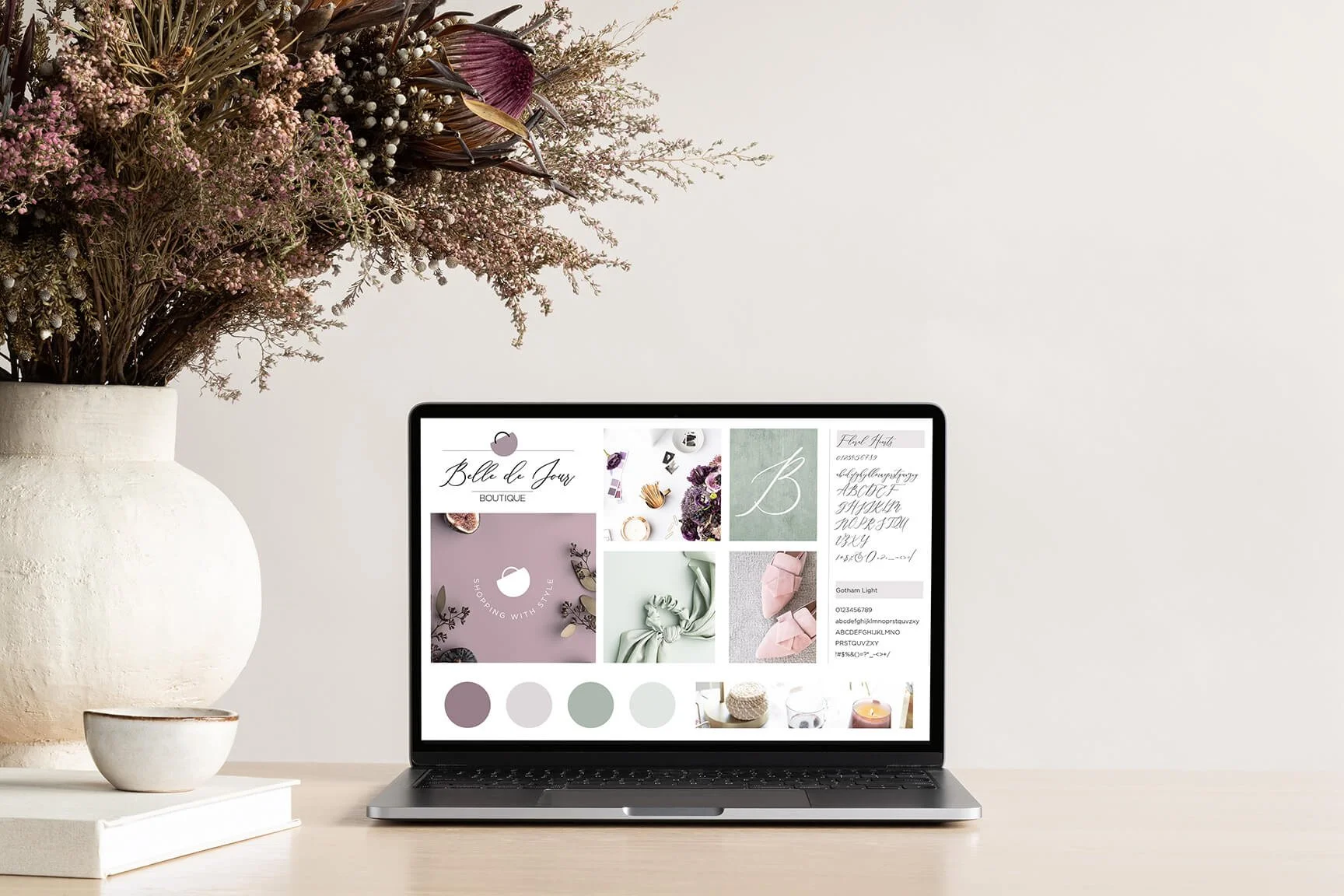
Larisa Hercog is a brilliant designer and photographer based in Slovenia. She is the head of Strala Design and the mastermind behind Capri, a chic Squarespace template created through Squaremuse Market. Larisa has an eye for all things pretty and a refined taste when it comes to aesthetic, proportion, colour, and font combinations. Keep reading to get to know her and learn about her creative process.
Squaremuse Market Designer Spotlight: Larisa Hercog

Following the Designer Spotlight series, where we get to know a bit more about the designers behind the Squaremuse Market design kits, we are talking to Larisa Hercog from Strala Design.
Larisa has an eye for all things pretty and her website is living proof of that. Capri, her latest design built in collaboration with Squaremuse Market, is a gorgeous template with a modern editorial vibe that suits wedding and lifestyle photographers, event planners, bloggers, and other vendors.
HI LARISA! THANK YOU SO MUCH FOR BEING HERE! TO BEGIN WITH, TELL US ABOUT YOURSELF.
I'm Larisa, working under the brand name Strala Design. I'm based in Slovenia, but most of the projects are done online. I’ve been in the design business for over 20 years, but I'm always looking for fresh, new ideas and trying to introduce them to my clients.
HOW DID YOU GET STARTED IN DESIGN?
Since I can remember I’ve always liked creating something nice and meaningful, like vitrages, walls, and other decorations, unique Christmas cards, candles, painted glass, and other creative products with whatever materials I had (seashells, starfish, rocks, branches, etc.). I finished high school in Design and photography and have been working in the design business ever since.
HOW DO YOU THINK YOUR PREVIOUS BACKGROUND HELPS IN YOUR DESIGN CAREER?
When we had a mandatory internship I learned how to use all the necessary knowledge to bring the whole project from idea to print. It was hard work but worth it to realize that design is not just making nice things. It takes much more than that: ideas, design processes, technical solutions, communication, meetings, and marketing.
WHAT DO YOU LOVE THE MOST ABOUT BEING A DESIGNER?
To present new ideas to my clients and know I can help them solve their marketing problems.
WHO IS YOUR TYPICAL CLIENT?
My typical clients listen to my professional advice, are open to making changes to their original ideas, and typically don’t ask for too many edits/revisions along the way. They believe in me, my talent, and my vision — just as any good client should!
HOW WOULD YOU DESCRIBE YOUR DESIGN STYLE?
It is minimalistic with polished elements which could last forever. I usually add some details that make them special and unique. I also have to accept compromises because of my clients’ needs.
WHAT IS YOUR DESIGN PROCESS LIKE?
First, I set a time and price framework and discuss my client's expectations. After approval, we work closely to implement the brand and website as smoothly as possible. After each stage, the client is able to request revisions to ensure that everything is perfect. Once the final invoice has been fulfilled, all digital files are released. Finally, the client can accept all the compliments that will come in about their new awesome design!
WHAT COMES FIRST IN THE DESIGN PROCESS: AESTHETICS OR CONTENT?
The content always comes first, but I have to predict how it will match the design. It is usually adapted through the design process.
WHERE DO YOU FIND INSPIRATION FOR NEW DESIGNS?
Everywhere. I'm looking for new and fresh ideas all the time, on the internet or in print samples. I always look to make the design different and unique for it to stand out.
WHO DO YOU FOLLOW THAT GETS YOU INSPIRED AND WHY?
I follow many different design agencies or individual designers. If they inspire me, I can use such ideas in my workflow and redesign them. The truth is they are usually done in a totally different way. I follow Flothemes and Squaremuse because I like their websites with polished design and they fit my style. As I mentioned before, Squaremuse Market is my favourite. They are open to prospective designers and I also work with them. You can find my new Capri website template there.
WHAT’S YOUR ALL-TIME FAVORITE DESIGN TREND THAT NEVER GOES OUT OF STYLE?
Clean and minimalistic, with subdued colour tones and modern typography.
WHAT WEBSITE PLATFORMS HAVE YOU WORKED ON BEFORE? DO YOU HAVE A FAVORITE ONE?
My first website was built on WordPress, but as a designer, I wanted something new. I built my website on Format, Wix, Squarespace (Squaremuse wasn't there yet). Then I found Webflow, a really creative platform, but a little pricey if you want to take advantage of all the possibilities. After that, I approached Showit, where I've built templates. For my own design needs, I was looking for the best options between features and price, so I decided to use Flothemes. Regardless of the fact that I am building templates for other platforms, Squaremuse offered me a collaboration to create one for Squarespace. When the project was done, I found that Squarespace is a really good option for creatives. They offered a blog and a shop on the same platform with an easy process, where you can publish your website relatively fast and without a lot of knowledge. It's similar to Showit, but on Squarespace you get an all-in-one solution, without the need to look for external providers for a shop.
TELL US ABOUT YOUR EXPERIENCE OF WORKING WITH THE SQUAREMUSE TEAM WITHIN THE MARKET. ANY TIPS FOR DESIGNERS WHO WANT TO START CREATING AND SELLING TEMPLATES?
The Squaremuse team is extremely professional and supportive. You really have freedom when designing a website template, based on their brief. The whole process is made on Figma, so you don't have to worry about technical and developing issues. If you're a designer with a sense of clean and polished lines, I think the best option is to explore your potential.


