Whether you're launching an online course, running a workshop/event, or offering a limited product, it all comes down to one goal: it should SELL. In order to do that, you need a good sales page - one that will convert as many website visitors into actual paying clients. Not sure how to create a Squarespace landing page that sells your product efficiently? We've got you covered! Keep reading.
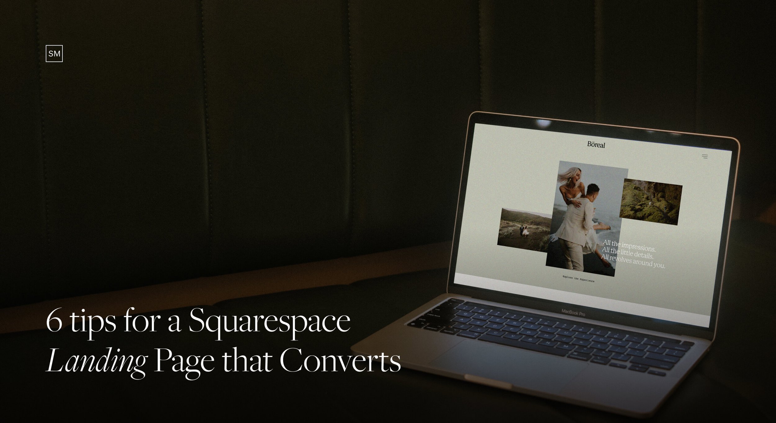
6 Tips for a Squarespace Landing Page that Converts
A landing page is where a person "lands" on your Squarespace website, after clicking on a link they receive in an email, see in ads, find in your bio, or tap on via Instagram stories. While your generic portfolio website encourages users to explore and get acquainted with your work, a landing page has one single purpose: to convert. As a rule, it's very focused and presents a specific product, event, service, etc., rather than tackling more offerings at once.
How to build an effective Landing Page?
#1: Make it clear and to the point
Your purpose is to get visitors to sign up for your course or to buy your product. Hence, everything on your page should revolve around this goal. Don't distract people with anything else that's not related to your specific offering. Use straightforward copy and call to actions to guide users towards your goal. Avoid adding info or links that don't serve your initial purpose, otherwise, you might lose potential leads.
#2: Use an active voice, as well as verbs and pronouns in the second person
Communicate with the reader directly. Second-person verbs and pronouns (you, your, yours) give the impression that the action is happening to the reader and not to some random person. Try to spot the difference between "Do you struggle with Instagram captions? This copywriting course is for you." versus "This copywriting course is for people who struggle with Instagram captions."
#3: Try to make it less salesy
Think about your landing page as a narrative, rather than a transactional process. As much as you want your product to sell, you also want to help the client. If you're not genuine about it, people will feel that. Communicate in a caring way. Let users know you understand them, you relate to their struggles and your product can help them with that.


6 sections to include in your Landing Page
1. What you're offering and who it's for
Right off the start, you must be clear on what you're selling and who the product is for. This helps you filter out the leads right away, honing in on exactly the right people you want to keep on the page. State clearly what you're offering (ie. An Instagram Reels Course, A Copywriting course to help you write better captions, etc.). Next, add a section with "This course is for you if.." and a few items that touch upon the user's pain points.
2. Benefits and deliverables (What the user gets)
Add all the benefits and deliverables the person gets when they sign up/purchase the product. Don't hold back - the more benefits you share, the more value you assign to your offer. If you're selling a course, you can mention things like 50 hours of video content, accompanying worksheets, one-on-one sessions, etc.
3. Investment Packages
Set the pricing expectations right away - whether you include the full price or just a starting price. Don't make your visitors work hard to find out how much they have to pay. Even better if you have several packages to choose from, based on deliverables, as you give people the option to control their budget.
4. Social Proof
Social proof is anything that builds more trust and convinces the user why they should buy your product. Written client testimonials, examples of your work, awards and credentials, success stories from previous users - in a written or a video format, and some info about the author/expert, to add a personal feeling and a face behind the brand.
5. FAQ's
FAQs save you lots of time and back-and-forth emails. Leave zero questions unanswered. If something isn't clear and the user has to figure it out or contact you additionally, you risk losing leads. Serve all the information on a silver platter. It will save both your time and theirs.
6. A Closing Argument + Call to Actions
The last section on your page should always be a call to action - sign up, purchase, enroll etc. Include a convincing closing argument that focuses on your user and their struggles. Even better if you add a sense of urgency, usually a countdown with that says "Sign up by December 20th, and get a discounted price" or "3 days left to enroll in my course".
Additionally, make sure to add CTA buttons throughout the page, to remind users that they can purchase at any time, not only when they get to the end of the page.
~
Need some inspiration? Here are some great examples from our clients, who built awesome Landing Pages using a Squaremuse Sales page.
The Zielverliebt Academy | Online Business Course | Built with Course Sales Page

Kate Cullen Illumination Course | Branding and Visual Identity Course | Built with Course Sales Page

Are you feeling stuck with your Landing Page? We've done all the homework for you and packed all the strategic sections into our pre-made sales pages, including a designated Course Sales Page. Just add your own text, images, and branding assets - and you're ready to rock. Want 20% off? Use code: HAPPYMUSE20 at checkout and save $40 on your purchase.