Polishing Mobile Screens
In this article we will go over the mobile settings for your design.
To view the mobile version of the site you need to hover over the top of your simulated preview in your Squarespace account and select from the available icons to view your site in simulated mobile view.

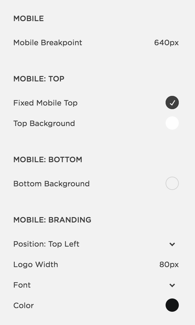
Main options that you will need to set on mobile is your header menu bar and logo position, and open menu options with font styling. These are set inside your Style Editor tab. For Ónyx design the styling options are as following: